Turns out, your closet doesn’t need a personality crisis every season.
I spent years buying things that looked good on the rack but made me feel like a fraud wearing them. Then I finally figured out: seasonal color analysis isn’t aesthetic gatekeeping—it’s actually just science meeting self-care.
My skin sings in warm golds. Cool silvers? They drain me. I started testing swatches in natural light, comparing them to my actual face (wild concept, I know), and suddenly getting dressed stopped feeling exhausting.
This realization didn’t just transform my wardrobe. It spilled into everything—my apartment, my choices, my entire vibe.
That’s why I created The Suburban Minimalist. To prove you don’t need more stuff. You just need the *right* stuff.
The Capsule Wardrobe Experiment That Actually Changed Everything
Last fall, I committed to a brutal closet edit. Kept only pieces that aligned with my true seasonal palette—mostly warm neutrals and jewel tones. I felt terrified removing everything else. But here’s what happened: getting ready became meditative instead of paralyzing. My color analysis journey taught me that intentional living means fewer decisions, less mental load, and actual joy wearing clothes that genuinely work. Color theory, personal styling, and minimalist fashion aren’t separate pursuits. They’re the same commitment to authenticity and clarity.
Quick Takeaways
- Determine your season (Autumn or Winter) by evaluating undertones, depth, and how your skin, hair, and eyes interact with natural light.
- Test fabrics and textures under daylight to see how warmth or coolness shifts your overall appearance.
- Use monochrome silhouettes and vertical color blocks to judge which palette enhances your natural contrasts or harmony.
- Build a seasonal swatches kit to compare true skin tone against fabrics, noting how textures affect color perception.
- Align wardrobe with minimalism, clean lines, and restrained patterns to let your season’s colors and textures guide cohesion.
What Defines Autumn vs Winter Personal Color (At a Glance)
Autumn and Winter personal colors aren’t about luck or mood boards alone; they’re about how your skin, hair, and eyes interact with the light of the season.
Autumn and Winter colors reveal how skin, hair, and eyes respond to seasonal light.
I notice color psychology at work when golds glow softly and pewter fabrics mirror the afternoon sky. Autumn tones lean warm, earthy, and cozy, while Winter favors crisp contrast and sleek textures.
Fabric textures matter—velvet warmth, satin sheen, or wool’s quiet depth shift perception in a room. Recognizing complexion analysis can help you select colors that complement your natural features for a more harmonious wardrobe.
Understanding seasonal color theory offers insight into how different palettes work best with certain skin tones and personal features, guiding you toward colors that truly enhance your look.
I created this site, The Suburban Minimalist, to explain how these choices shape calm spaces and wardrobes alike.
Curious about your palette? Let’s explore together, friend.
How to Identify Undertone and Depth for Each Season
Undertones aren’t something you Federer over in passing; they’re the subtle math behind every color you reach for. I pace my closet, noting how cool whites glow against warm wood, and I ask you: what does your skin teach the room? Undertone and depth aren’t fixed, they breathe with light, texture, and mood. For instance, woven pet toy baskets show how texture can be a visual cue that influences color perception and mood. I’ve learned to read depth like a skyline—soft, medium, bold—and test it with a scarf on a Tuesday. Additionally, understanding the color theory behind this process helps clarify how colors interact with different skin undertones. Textural contrast and accessory pairing become clues, not rules.
Ready to experiment together?
Autumn Warmth vs Winter Clarity: Signature Palettes
There’s a quiet drama in palettes, isn’t there—the way autumn’s amber warmth hugs our spaces while winter’s crystal clarity slices through noise enough to feel calm again. I notice how Autumn Warmth invites cozy textures, while Winter Clarity favors clean lines and crisp contrasts. Incorporating dog toy storage solutions can also help maintain these themes, ensuring your space stays serene and organized amidst seasonal changes. I’m refining signature palettes for Seasonal home decor, testing how burnt orange, moss, and milk-white mingle in dining nooks or entryways. Developing a color harmony can further enhance cohesiveness, so your decor feels intentional and balanced. Do you crave outdoor aesthetic coordination that still feels cohesive indoors? This balance helps me teach, gently guiding you toward rooms that glow with ease, not effort.
Isn’t that the Suburban Minimalist promise I created here?
Testing Color Accuracy in Your Wardrobe: Quick Checks
Color accuracy isn’t magic; it’s measurement you can trust. I test colors by comparing true-skin light with fabric textures under natural light, noting any shift that makes a cool blue look gray or a warm beige go muddy. A reliable test involves examining personal color assessment techniques to ensure your wardrobe choices match your seasonal palette. Ensuring consistent lighting conditions is key to avoiding false impressions caused by lighting distortions, which can alter how colors appear. Do you see the same in your closet, or is your lamp betraying you? Color psychology matters here: a shade can lift mood or quiet nerves, so I’m picky about repeats and swatches. Quick checks feel doable, not sprinkling fairy dust.
Color accuracy isn’t magic; it’s measurement you can trust.
- Use daylight chips over artificial glare
- Compare swatches next to skin and furniture
- Track notes for seasonal shifts
Translating Season Into Silhouette: Mastering Monochrome Across Seasons
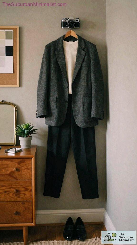
Seasonal shifts don’t have to derail my look; they’re really invitations to refine the silhouette I wear. I’m drawn to monochrome because it stretches across seasons, keeping lines clean even when textures shift. Do you feel how a single shade can carry botanical motifs on a cardigan and still feel new? A good understanding of winter vs autumn color analysis helps me choose hues that suit each season and enhance my overall aesthetic. Recognizing how seasonal color palettes influence wardrobe choices allows me to create cohesive, versatile outfits. I pair Vintage textures with sharp, tailored pieces to keep depth without clutter. I’ve learned to layer with restraint, letting rhythm breathe between light and shadow. This isn’t just style; it’s a philosophy I created for The Suburban Minimalist, naturally shaping every room, wardrobe, and moment.
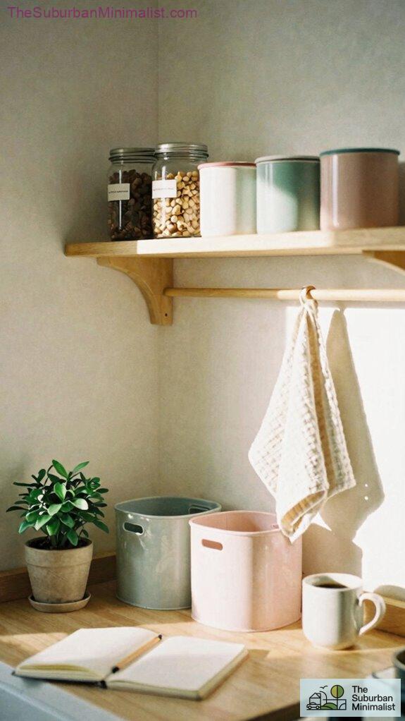
Seasonal Color Swatches Kit
A Seasonal Color Swatches Kit is a tiny, thoughtful toolkit I reach for whenever the calendar nudges me toward a new mood. I flick through fabric swatches, giggling at how Eco friendly fabrics can quietly redefine my closet, one hue at a time.
A tiny toolkit nudging my closet toward calmer, eco-friendly hues.
Do you notice how a simple card changes how I see a room, a handbag, a scarf? I keep notes on handbag organization and color pairs that feel like home. Additionally, I’ve learned that top rollaway guest beds can make a guest stay remarkably comfortable, much like choosing the right seasonal palette enhances your wardrobe.
This kit isn’t magic, it’s a habit I created to slow the rush, inspired by The Suburban Minimalist, woven into my everyday design.
- Compact, reusable swatch cards
- Color pair prompts for outfits
- Cleanable storage pouch
- Personal color theory helps me understand which hues match my natural features and emotional expression.
Personal Color Swatch Kickoff
I’ve always been curious about how color reads on a real person, not just on a swatch card, so I’m starting with a Personal Color Swatch Kickoff that feels honest and practical.
I want you to see how tone shifts when you’re home, not in a studio. We’ll test ideas through quick outfits, tidy corners, and a few outdoor aesthetics moments that spark joy.
Do you notice the way home organization guides mood and choices? I’ve learned to listen for the tiny feedback—fabric weight, light, texture—before buying.
Why I created this website The Suburban Minimalist, you ask? because clarity breeds calm, everywhere. Understanding how natural light influences color perception can help you select shades that truly complement your environment.
Monochrome Silhouette Mastery
Monochrome Silhouette Mastery isn’t about marching in step with a trend; it’s about lengthening the line on my body and letting color do the talking, one clean shape at a time. Have you noticed how a single hue flows into your favorite sofa? I’ve learned that vertical swaths win: the eye follows, the frame feels taller, and pockets of Botanical textures peek like secret notes. Incorporating Spring Fashion Mood Boards can inspire fresh minimalistic ideas, emphasizing seasonal palettes and textures. Sometimes, playing with minimalist design principles reveals new ways to achieve harmony in your wardrobe. Vintage accessories ground the look, sparking stories without shouting. This isn’t just style; it’s a quiet map for a calmer closet, a nod to The Suburban Minimalist, and a playful dare to dream.
- Embrace monochrome blocks with botanical textures for depth
- Pair vintage accessories with crisp lines to spark dialogue
- Let textures and tone guide mood over trend-driven details
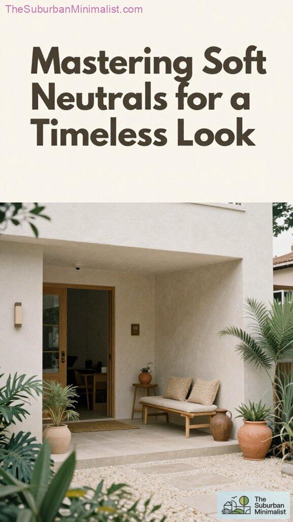
Suburban Minimalism
Suburban Minimalism isn’t about stripping life down to the bone; it’s about curating space so every item earns its keep and still feels easy on the eye. I’m writing to you from a sunlit kitchen, thinking: how can we keep joy in order? Home organization becomes a quiet act of care, not confinement, a minimal aesthetic that invites breathing room. Do you crave simplicity with personality? I do. I’ve learned to tuck clutter into clever bins, label softly, and choose pieces that glow with purpose. Incorporating a color-coordinated palette can transform your space into a harmonious retreat that feels both calm and inviting. I’ve also explored how intentional color choices elevate a simple aesthetic without overwhelming it. Why I created this website The Suburban Minimalist feels natural—a lifeline for thoughtful living.
FAQ
How Often Should I Reassess My Seasonal Color as I Age?
I reassess my seasonal color annually, as aging shifts personal color psychology and seasonal wardrobe planning subtly. I stay curious, testing tweaks each year to preserve innovation, harmony, and confidence in my signature look for the long term.
Can Skin Undertone Change With Sun Exposure or Skincare?
Skin undertone can shift with sun exposure and skincare, I’ve noticed subtle changes that surprise me. I’ll track Skin tone adjustments, watching Sun exposure effects as I innovate, adapting palettes while you watch, wondering what’s really beneath the glow.
Is There Overlap Between Seasons for Those With Neutral Complexions?
Yes, there’s overlap for neutral complexions; I embrace a flexible seasonal palette, exploring color harmony across boundaries. I experiment with subtle neutrals and softly tanged hues, updating my wardrobe as seasons blur for innovative style outcomes.
Which Lighting Is Best to Test Color Accuracy at Home?
Natural daylight is best for testing color accuracy at home. Use color temperature-consistent light and neutral bulbs; I test under natural daylight first, then compare with a balanced color temperature to confirm true tones for innovative styling.
How Do Textures Influence Color Perception in a Monochrome Look?
Textures shift color perception in a monochrome look; I notice fabric finishes create visual depth, and I adapt accordingly. I mix tactile contrasts to innovate, ensuring each piece delivers dynamic nuance through texture, not hue alone.
Summary
I’ve learned that color isn’t a trend but a map, guiding me toward calmer mornings and sharper outfits. Fun fact: only about 12% of people truly wear the “perfect” season, yet I see dozens click through our color tests and finally breathe—like turning on a porch light after dusk. So, tell me: what’s one hue you’ve waited to embrace? Your closet, and your home, will thank you for choosing with intention—because clarity looks gorgeous on you.