Ever had that moment when your home feels like a chaotic mess? Yeah, me too.
I decided to tackle that by diving into DIY color consultations.
First, I figured out my vibe—earthy tones with a hint of sass. Then, I took a good look at my spaces, trying to catch the natural light like an amateur photographer.
Armed with apps and color wheels, I played with palettes as if I were a kid in a candy store. And guess what? I created a space that screams "me."
Stick around; I've got more tricks up my sleeve for my fellow suburban minimalists!
The Art of Minimalist Fashion Mood Boards: My Creative Journey
Let me tell you, creating fashion mood boards is like therapy for the soul. I remember the first time I pieced one together. I was trying to curate a minimalist wardrobe, ditching those "I'll wear it someday" pieces.
I gathered fabric swatches, magazine clippings, and my trusty Pinterest board—because who doesn't love a little online inspiration?
Every layer I added felt like a step towards clarity, helping me see which colors and styles truly fit my aesthetic.
Now, I use these boards to refine my choices, ensuring each piece resonates with my minimalist vibe. Who knew less could be so much more, right?
Quick Takeaways
- Identify your personal color undertones and seasonal type to guide your choices effectively.
- Assess natural lighting in your spaces to understand how colors will appear throughout the day.
- Use color analysis apps and online tools for quick and accurate color selection guidance.
- Sample larger paint swatches in your rooms to observe their interaction with natural light and decor.
- Apply the 60-30-10 rule for color balance, ensuring a harmonious and visually appealing palette.
Prepare Elements and Preferences

When I first decided to plunge into color consultation at home, I realized just how important it's to prepare the right elements and preferences.
Setting the stage is essential. I found that natural light is my best ally, so I always work near a window during the day. A neutral background keeps distractions at bay, allowing colors to shine. Avoiding artificial lighting helps prevent color distortion and allows for a more accurate analysis. Choosing colors that align with your complexion can dramatically enhance the overall aesthetic of your space.
Setting the scene is crucial; natural light and a neutral backdrop let colors truly stand out.
Who wants to battle with clutter or patterned furniture?
And let's not forget about quiet! A serene environment sharpens focus.
Plus, identifying my undertones was a game-changer. From warm golden hues to cool blue tones, knowing what suits me transformed my approach.
Getting it right isn't just about color; it's about crafting a powerful, personal aesthetic.
Isn't that what we all deserve?
Assess Current Interior and Exterior

After laying the groundwork with my personal preferences, it's time to take a closer look at what I've got going on around me. Evaluating my current interior and exterior is vital for making powerful color decisions.
| Feature | Evaluation |
|---|---|
| Existing Colors | Can I keep my walls, or is a change needed? |
| Natural Lighting | How does the light shift my color perception? |
| Furniture & Decor | Do new colors complement my existing pieces? |
| Architectural Style | What color suits my home's design? |
| Neighborhood Aesthetics | How can I harmonize with my surroundings? |
To create a cohesive look, understanding your perfect home color palette can significantly enhance your design choices.
Utilize Tools and Resources

Exploring the right tools and resources can feel like unearthing hidden treasures, especially when you're ready to commence on a color journey for your home.
With the right support, you can confidently transform your spaces. Here are a few gems to weigh:
- Color Analysis Apps – They deliver quick, accurate results from your selfies, and many are free!
- Online Color Analysis Tools – User-friendly platforms guide you through selecting your best hues with ease.
- Digital Color Palette Design – Craft a personalized palette that aligns with your style and wardrobe.
- Physical Aids Like Color Fans – These handy tools provide tangible guidance, making color choices effortless during shopping.
Isn't it exciting how technology and creativity can work together? Additionally, understanding how to create your perfect personal color palette can enhance your overall design experience.
Consider Mood and Ambiance

Choosing the right colors for your home isn't just about aesthetics; it's about capturing the mood and ambiance you want to create in each space.
Have you ever walked into a room and instantly felt energized or relaxed? That's the power of color!
The right colors in a room can evoke powerful feelings, energizing or soothing us in an instant.
For instance, warm tones like red and orange can ignite conversation in your kitchen, while cool shades like soft blue can lull you into tranquility in the bedroom.
Think about the vibe you want. Cozy, airy, energetic, or calming?
Check HOA Requirements

Before diving into a vibrant palette for your home, it's essential to check in with your Homeowners Association (HOA).
You wouldn't want to pick a bold shade only to face fines or repaint orders, right? Trust me, I've been there.
Here's how to navigate the HOA maze:
- Review your community's Covenants, Conditions, and Restrictions (CC&Rs) for guidelines.
- Look for pre-approved color palettes on the HOA website or consult with board members.
- Talk to your neighbors who've recently painted for insider tips.
- Pay special attention to unique materials like brick or wood that may have specific rules.
Test Colors With Samples

When it comes to testing colors for your home, there's one golden rule I've learned: sampling is your best friend.
Using larger paint samples is essential. They give you a real feel for how a color plays with your space. I always apply samples near trim—it's amazing how different light can make a shade feel.
Larger paint samples are key to understanding how color interacts with your space. Always test near trim for the best results!
Have you ever noticed how a color can change from morning to evening? That's the power of natural light! In addition, understanding your color season can help you choose shades that complement your overall aesthetic.
Trust me, I've made costly mistakes by skipping this step. If you want to avoid a color catastrophe, take the time to test.
This is why I created The Suburban Minimalist—to empower others to make bold, confident choices. So, grab those samples and let's get started!
Consult Inspiration Sources

Exploring colors for your home doesn't stop at testing samples; it's all about seeking inspiration from various sources that resonate with your personal style.
I've found that tapping into diverse inspiration can ignite creativity and empower my choices. Here are some sources I love to consult:
- Paint Samples: They're tangible and can spark unexpected ideas.
- Social Media: Platforms like TikTok showcase trendy color combinations that might surprise you.
- Seasonal Color Guides: These guides offer palettes tailored for different seasons, aligning with your vibe.
- Blogs and Vlogs: They provide tips and stories that inspire my own color journey. Additionally, consider color analysis techniques that can help you understand which hues complement your unique tone.
Narrow Down Options

Narrowing down your color options can feel like trying to pick a favorite child—impossible, right?
To tackle this task, start by evaluating your home's existing elements. Look at your flooring, kitchen fixtures, and even the color of your fireplace tiles. These details are essential in guiding your choices.
Evaluate your home's existing elements like flooring and fixtures; these details will guide your color choices perfectly.
Next, immerse yourself in the world of color families. Grab those swatches from brands like Sherwin-Williams or Benjamin Moore. Trust me, larger samples help you visualize better.
And don't forget your personal style! Gather images that resonate with you, and make a note of colors you can't stand.
Utilize Digital Mockups

After sifting through paint swatches and wall colors that might match your style, it's time to bring those ideas to life.
Digital mockups are your secret weapon for visualizing color changes without the mess.
Here's how to make the most of them:
- Use Digital Visualizers: Platforms like Sherwin-Williams allow you to simulate colors on your walls, making it easy to visualize your ideas.
- Create Mockups: Utilize design tools like Adobe Creative Cloud to experiment with different color schemes swiftly.
- Choose Accent Colors: Test complementary shades and see how they harmonize with your primary wall colors.
- Adjust Lighting: Simulate various lighting conditions to guarantee your choices shine in any environment.
Why not take the plunge and make your space uniquely yours?
Ultimate Guide to DIY At-Home Color Consultation

Color can transform a space, and diving into a DIY at-home color consultation is an exciting journey that can lead to a home you truly love.
Start by gathering inspiration—think design magazines or Pinterest. What colors make your heart sing?
Gather inspiration from design magazines and Pinterest to discover the colors that resonate with your soul.
Next, assess the natural light in each room. Does it flood in or barely peek through?
Document existing features too; they're part of your canvas. Combine resources from brands like Sherwin-Williams for a broad palette.
As you select colors, test them against your trim and furniture. Does that bold hue clash or complement?
Remember, it's about creating harmony!
I've created The Suburban Minimalist to share this journey, helping you transform your home into a reflection of your unique style.
Characteristics of your Appearance

Appearance is like a blank canvas, waiting for the perfect colors to bring it to life. When I think about my own characteristics, I realize how pivotal they're in guiding my color choices.
Here's what you should consider:
- Undertones: Are you warm or cool? This can set the stage for your color palette.
- Value and Chroma: Do you shine in light, muted shades or deep, vibrant colors?
- Seasonal Type: Are you a spring, summer, autumn, or winter? Each has its unique flair.
- Contrast Levels: How do your hair, skin, and eyes interact? High contrast can create striking statements.
Understanding these traits not only empowers my wardrobe but also fuels my passion for decor, inspiring The Suburban Minimalist. Additionally, considering your personal color analysis can help you identify the shades that truly enhance your natural beauty.
Eye Color, Skin Tone, Hair Texture
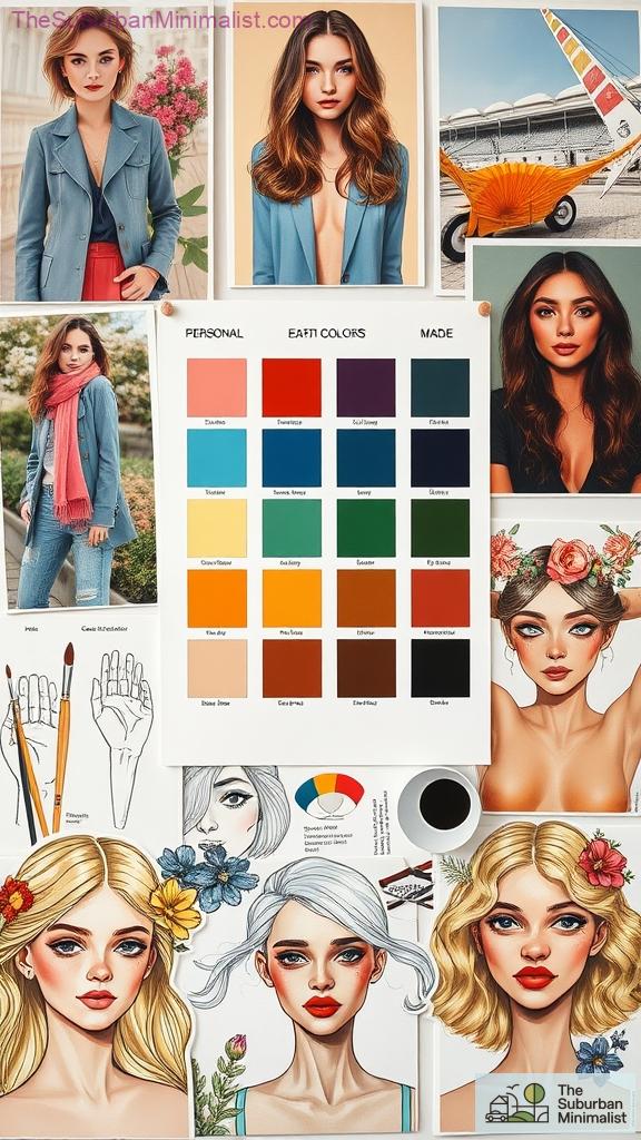
When I think about how my eye color, skin tone, and hair texture come together, it feels a bit like piecing together a puzzle.
My cool blue eyes demand colors that pop, while my warm skin tone craves those golden hues. Isn't it fascinating how one can influence the other?
The interplay of my vibrant blue eyes and warm skin tone creates a captivating dance of color.
I love draping various fabrics around my neck, watching how they either brighten or dull my complexion.
And then there's my hair texture, which can either amplify or soften my chosen palette.
Sometimes I wonder if I should call myself a color magician!
The Color Palette
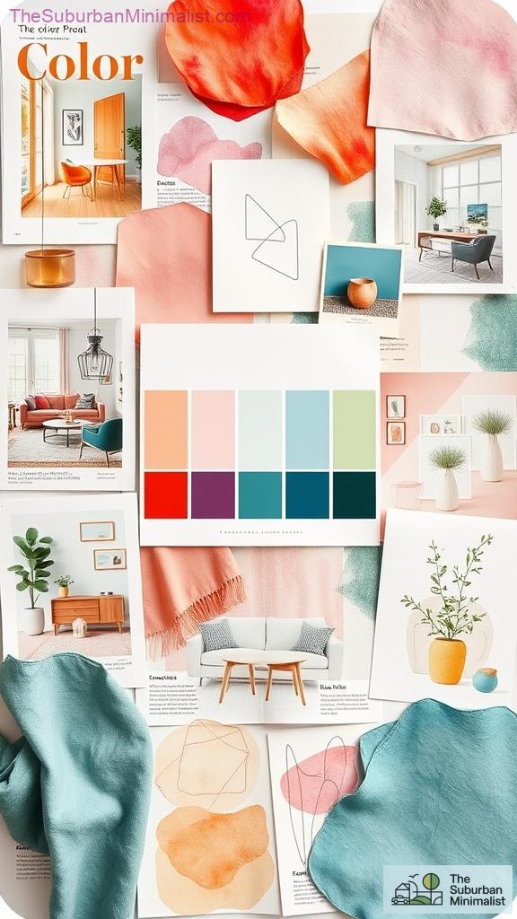
Creating a color palette often feels like starting on an adventure, especially when you realize how much it can transform your space.
It's not just about picking pretty colors; it's a powerful statement of who you are.
Here's how I approach it:
- Gather Inspiration: Look at design magazines or nature for ideas that resonate with you.
- Understand Color Theory: Familiarizing yourself with the color wheel can elevate your choices.
- Consider Mood: Choose colors that reflect the atmosphere you want—warm for coziness or cool for calmness.
- Apply the 60-30-10 Rule: Balance your dominant, secondary, and accent colors for a cohesive look.
Color Pairing Techniques

Color pairing techniques can feel like a secret language that reveals the potential of your home. Have you ever stood in front of a color wheel, unsure of how to wield its power?
Let's explore the magic of complementary colors, like the vibrant clash of orange and purple, energizing your space.
Or consider the tranquility of analogous colors, where shades of blue, green, and yellow dance harmoniously together.
For a bolder statement, triadic colors like red, yellow, and blue create striking visuals.
Each method offers unique vibes—whether you crave the sophistication of monochromatic palettes or the complexity of tetradic schemes.
Immerse yourself in these techniques with confidence, and watch your home transform into a reflection of your true self.
Chic Capsule Wardrobe Inspiration

Fashion can feel like a whirlwind, can't it? One minute you're drowning in choices, and the next you're wondering what to wear.
That's where a chic capsule wardrobe comes in. It's about curating a collection that empowers you, simplifies your life, and makes dressing effortless.
A chic capsule wardrobe empowers you to simplify your style and make dressing a breeze.
Here are four essentials to contemplate:
- A timeless Little Black Dress that shifts from day to night effortlessly.
- Versatile jeans that fit like a dream and pair well with anything.
- A tailored blazer that adds polish to any outfit.
- Quality accessories that let your personality shine.
References
- https://www.youtube.com/watch?v=m3bV-6UaMOs
- https://pmc.ncbi.nlm.nih.gov/articles/PMC8041175/
- https://www.happystartsathome.com/how-to-prepare-for-a-paint-color-consultation/
- https://www.embopress.org/page/journal/14602075/authorguide
- https://www.youtube.com/watch?v=srERbtBLtOw
- https://www.vivaldicolor.com/blog/color-analysis-from-home
- https://www.ucg.ac.me/skladiste/blog_609332/objava_105202/fajlovi/Creswell.pdf
- https://www.aupress.ca/app/uploads/OER-202302_Chamberlain_Dubberlboer_2023-Read-Think-Write.pdf
- https://gabriellearruda.com/discover-your-best-colors-diy-seasonal-color-analysis-guide/
- https://www.178wing.ang.af.mil/Portals/69/documents/afh33-337.pdf?ver=2016-12-15-101008-313

